CONCEPT & PROCESS
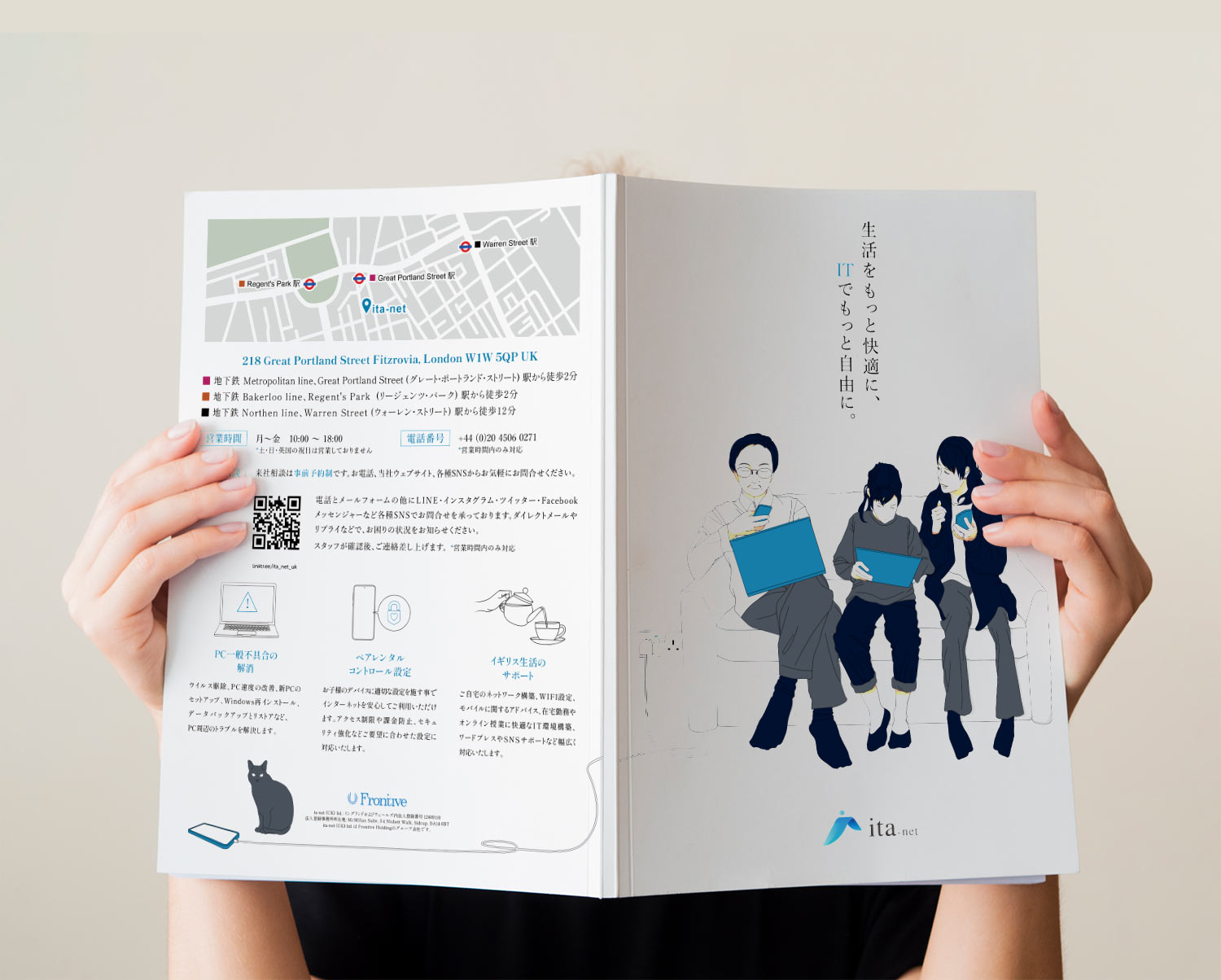
I created a digital and print brochure for ita-net (UK) Ltd., an IT company based in London. I handled various aspects of the project, including illustration, design, copywriting, and content creation. The target audience for this brochure was the potential Japanese clients in the UK, so the design focused on being easily readable for Japanese speakers and creating a sense of familiarity.
- Information Organization and Clarity:
I organized the information within the brochure, arranging it in a sequence that is easy to read and comprehend. I condensed the text, emphasizing key points. Headings were used for each section to facilitate a clear understanding of the content. - Visual Friendliness:
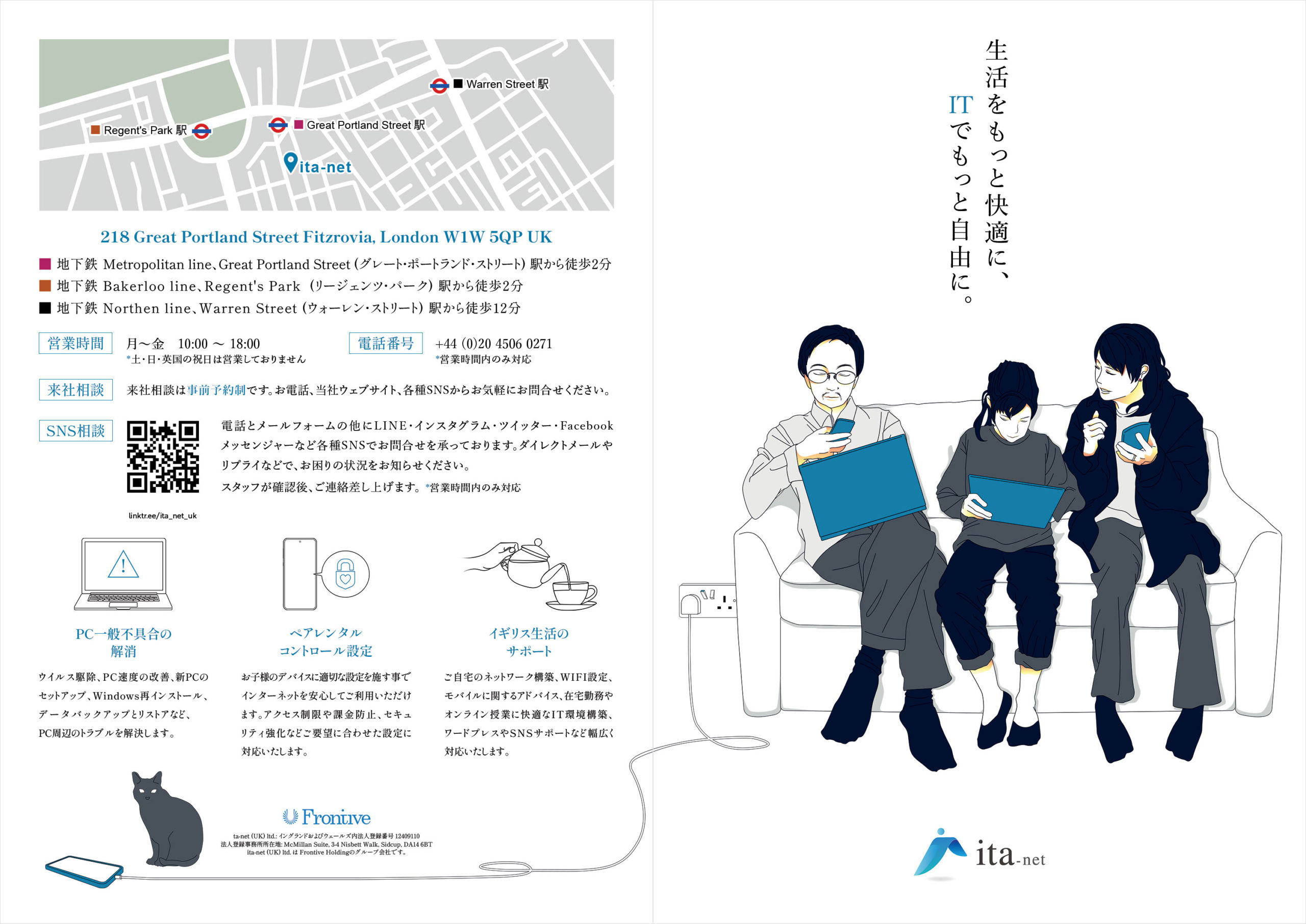
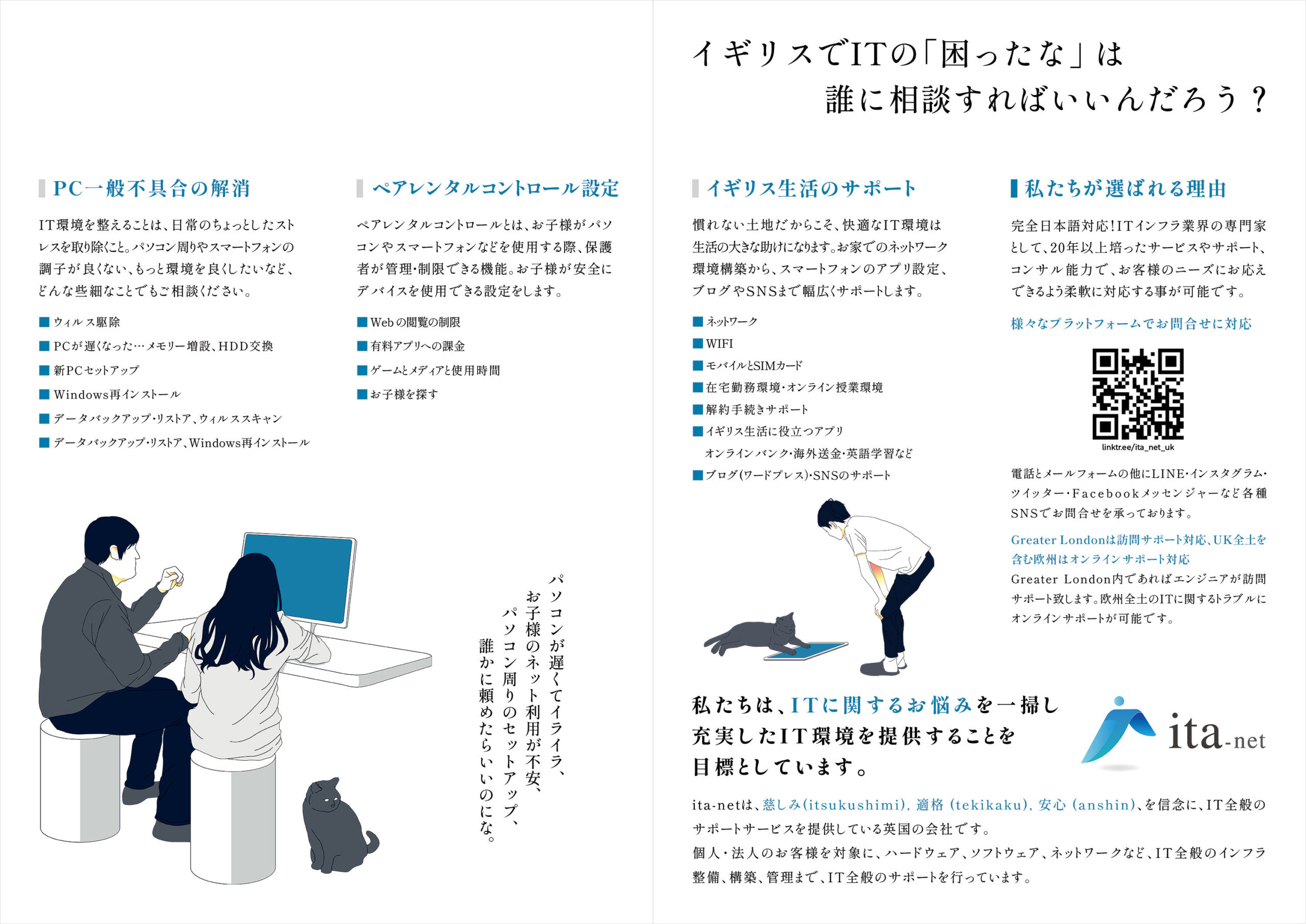
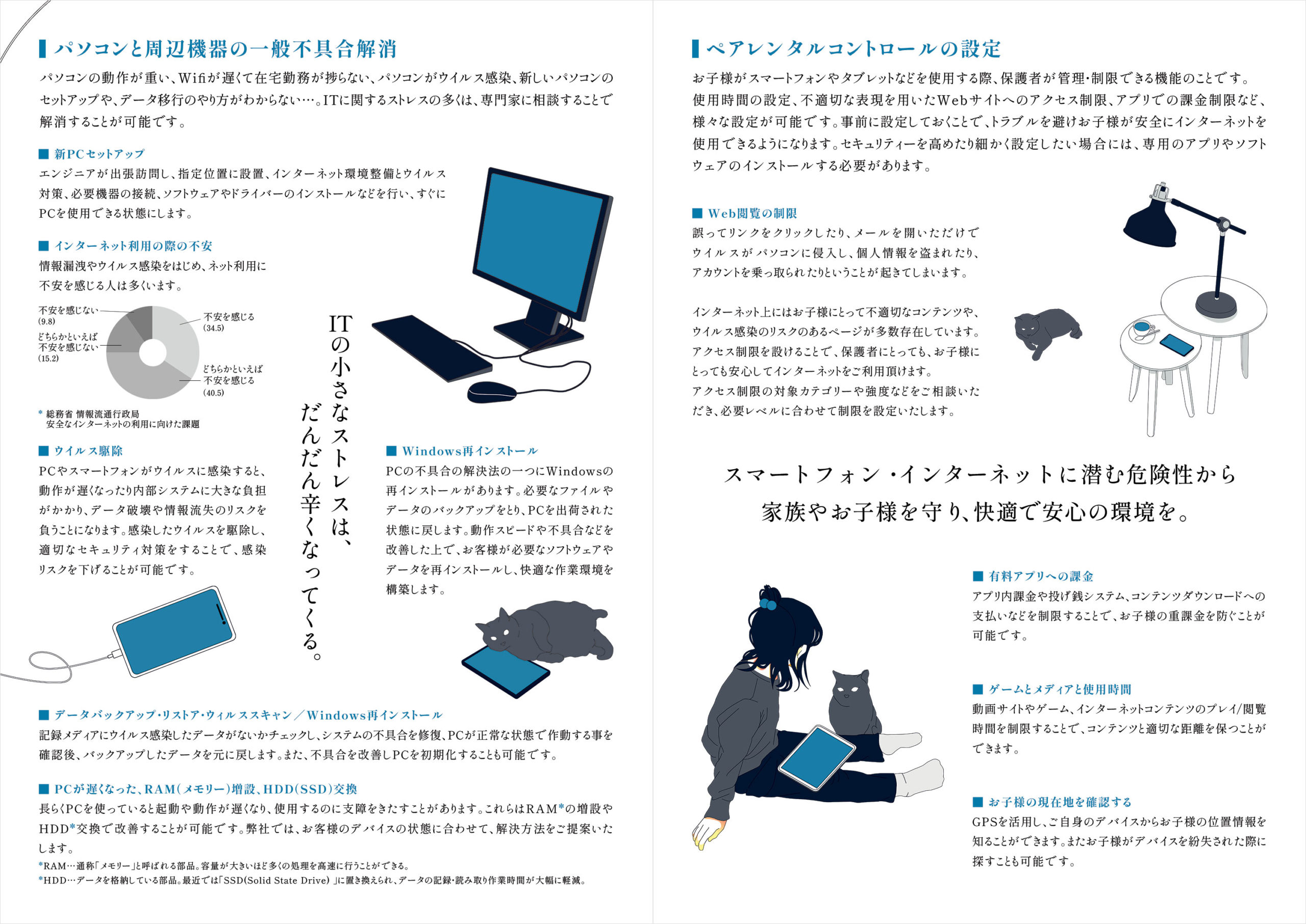
I incorporated the corporate color, blue, as the key color and created simple illustrations. These illustrations depicted various life scenarios where IT is involved, catering to different age groups and genders to enhance visual appeal and friendliness. - Application to Banners:
The same illustrations were applied to classified ads on “MixB,” targeting the Japanese community in the UK. This consistent use of illustrations helps maintain brand image continuity in advertising and promotional activities.→View Banner Design here.